(Please note that some of the links below are affiliate links at no additional cost to you, we will earn commission)
In this article, I’m going to focus only on the Thrive architect plugin and I’m going to share 10 of my favorite features.
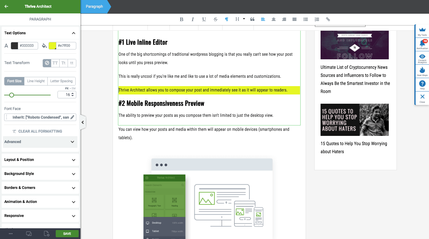
#1 Live Inline Editor
One of the big shortcomings of traditional wordpress blogging is that you really can’t see how your post looks until you press preview.
This is really uncool if you’re like me and like to use a lot of media elements and customizations.
Thrive Architect allows you to compose your post and immediately see it as it will appear to readers.
Here is exactly what I’m seeing as I proofread this article!

#2 Live Mobile Preview and Composition
The ability to preview your posts as you compose them isn’t limited to just the desktop view.
You can view how your posts will appear on mobile devices (smartphones and tablets).
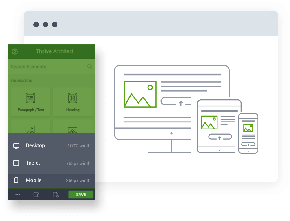
If you like, you can even compose your content from one of the mobile views, although I prefer having the space with the full desktop view to compose. I then go to mobile once the post is finished to edit and hide any elements that came out looking wonky.
This is AWESOME because a huge number of your readers will be viewing from mobile devices. In fact, it is very likely that MORE people will read your content on mobile than on desktop!
Many bloggers forget to even preview how their posts look on mobile (yes, I’ve been guilty of this too) and it can really hurt the bounce rates and overall perception of your site and qualifications.
So, what if you preview mobile and you find something that just doesn’t look right?
Normally, you’d have to delete the element (image, section, video etc) entirely from the post. This means it won’t appear on mobile, table OR desktop (even though desktop looked fine).
Not with Thrive Architect!
You can easily hide elements based on the device people are using to view the post.
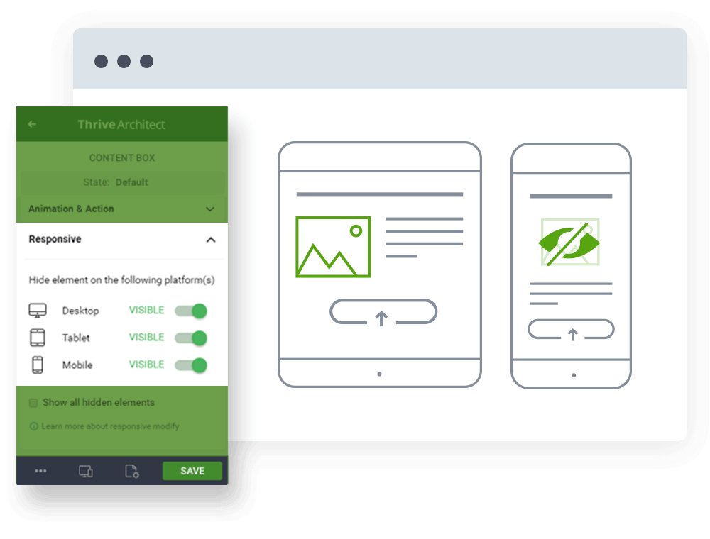
For example, you could keep that image on Desktop and tablets but hide it on smartphones.
Cool, right?!?
Seasoned bloggers will appreciate exactly how cool this is.
#3 Drag and Drop Everything in Your Posts
Easily drag elements across posts, change fonts, edit margins, create columns and more without needing to be an HTML wiz.
I’m actually pretty decent at HTML and even I have no clue how to make some of the customizations I do without the Thrive Architect plugin.
I often find myself moving sentences, paragraphs or even full sections of posts around in order. With Thrive architect, I can literally just click and drag the element to where I want it.
#4 Insert Table of Contents
I noticed some blogs adding really cool looking navigation menus atop their posts.
I googled “how to add table of contents to WordPress blog,” and kept getting links to plugins.
You really don’t want to get too plugin crazy so if I don’t absolutely need it, I typically don’t add it.
With Thrive Architect you can quickly and easily add a table of contents to your posts. You can place it anywhere you want (some plugins will default it to the top of the screen) and customize the look and feel without reasonable limitations.
You can choose which headings to use as sections (H2 as main and H3 as sub categories for instance).
Here is an example of what I’m talking about from another post I wrote (ironically, about creating the perfect blog post).
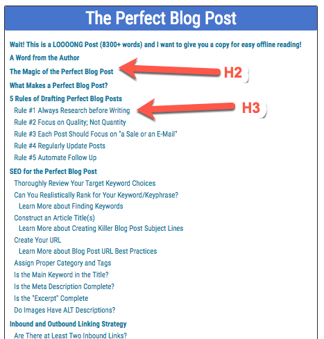
I set this to show my H2s as main chapters and H3s as sub chapters.
Pretty cool and very thoughtful to your readers if your posts are like that one and over 8,000 words long.
#5 Canned Templates
One things that many bloggers want is continuity in the style across their posts. When you have a lot of options like you do with Thrive Architect, it can be easy to draw too far outside the lines.
Even if you don’t mind your posts all looking pretty unique when compared to each other, it can take a lot of time to create new elements when you need them. And if you blog a lot, you’ll find yourself using the same elements over and over and over.
Thrive Architect lets you store templates of your past creations and styles for easy re-use later.
For example, if you created a pull-out quote style for a post and you wanted to use the same style again without starting from scratch (editing fonts, borders, etc) you could save it as a template and insert it into any other posts you create!
If you aren’t amazing at design, it’s best to keep using what you know looks good and works rather than trying to replicate the same quality over and over.
It’s ok if you aren’t a designer!
Even if you’re great at design, the templates option can be a huge time saver.
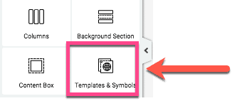
Once you click on the template and symbols on the editor widget, you simply drag it to the post and select from your saved elements.
Here is what some of mine look like.
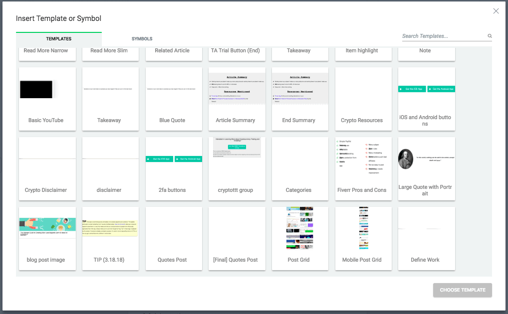
This is not a common option for most editors, especially any free options you might find.
#6 Customizable Buttons
If you have something you want your reader to click on, using a button is a great way to make it stand out from the fold. This is especially important if you have something to sell or download like a lead magnet.
Here is a button I made linking to Thrive Themes (where you can get the Thrive Architect plugin). Click Here to Buy Thrive Themes Now!
You can add icons, adjust the size, add sub text, add shadows and more…
If anything, you have too much control of your buttons design!
#7 Countdown Timers
Easily add a sense of urgency to blog posts with evergreen timers(example restart timer every 24 hours) or specific date/time countdowns (countdown to 6/27/2019 for instance)… my 30th birthday ?

DaysHoursMinutesSeconds
This feature would normally require a plugin or a software that specializes in sales pages, like Clickfunnels.
#8 Click to Tweet
I love this feature because it made all the other “click to tweet” plugins unnecessary.
Easily turn pieces of your blog posts into tweetable takeaways that will help get traffic back to your site and maybe even help you add a few new followers.
Click to tweets are an awesome way to get your message shared, gain Twitter followers AND make your blog posts easier on your readers eyes. #blogging #designClick to Tweet
#9 Smooth Animations and Actions
Keep your readers engaged by adding effects to elements in your posts. Click Here to Buy Thrive Themes Now!COOL ANIMATION EXAMPLE !
When done right, these can be a great way to keep reader’s attention.
Be careful to not overdo them though. Too much animation can annoy readers.
#10 Cool Image and Video Styles
I love using visuals in my blog posts!
Thrive themes lets me add a bunch of different effects to images and videos I share on my posts.
I can turn a boring picture like this…
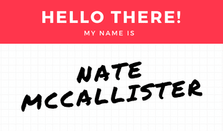
Into something that is a little more eye catching, like this.

Adding that lifted effect is just one of many options you have for images.
If you’d like to embed videos into your posts, there are a lot of cool options there as well.
And make it a bit more attention grabbing with one of the styles, like this one that makes it appear to play from within a tablet.
If you think these features are great, there are even more! These are just the 10 I like the most right now.
Definitely check out Thrive Themes if you’re interested in getting more out of every blog post you write!

